
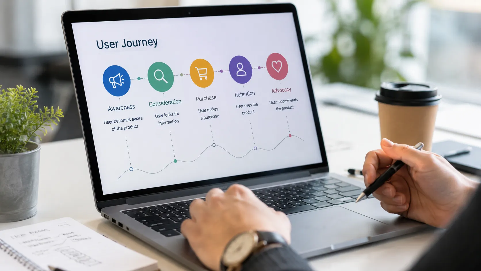
A great digital product should feel easy to use from beginning to end. Whether someone is browsing an online store, signing up for an app, booking a service, or reading an article, every step should feel connected and purposeful. When users can move through a product without confusion or unnecessary interruptions, they are more likely to complete what they came to do.
This is where user journey design becomes important. A seamless user journey is not simply about creating attractive screens. It is about understanding the complete experience and making sure every interaction helps users move naturally toward their goals.
What Is a User Journey?
A user journey is the series of steps a person takes while interacting with a product, website, or service.
For example, imagine someone visiting an online clothing store. Their journey might look like this:
Search → Landing Page → Browse Products → Product Details → Add to Cart → Checkout → Confirmation
Every stage can influence how the user feels about the experience. A confusing product page can make them leave. A complicated checkout can cause them to abandon their cart. On the other hand, clear navigation and helpful information can make the entire process feel effortless.
The goal of UX design is to make these steps work together instead of treating every screen as an isolated design.
Start With the User’s Goal
Before designing a journey, understand what the user actually wants to accomplish.
Different users can have completely different goals. Someone visiting a banking app may want to transfer money, while another person may simply want to check their balance. A visitor to an e-commerce website might want to compare products before making a purchase.
Start by asking:
- What brought the user to the product?
- What are they trying to accomplish?
- What information do they need?
- What could prevent them from completing the task?
Answering these questions gives you a much clearer foundation for your design decisions.
Understand Your Users
You cannot create a smooth journey without understanding the people who will use your product.
User research can help reveal common behaviors, frustrations, expectations, and needs. This research doesn’t always have to be complicated. Interviews, surveys, usability tests, customer feedback, and analytics can all provide valuable insights.
Pay attention to what users actually do rather than only what they say they want. Sometimes a person may describe a feature as important, but their behavior shows that they rarely use it.
Good UX design combines both perspectives.
Map the Current Journey
Once you understand your users, map out their existing journey.
A simple journey map can show:
- Entry point — How does the user arrive?
- Actions — What do they do next?
- Decisions — What choices do they have to make?
- Problems — Where might they become confused?
- Outcome — What happens after completing the task?
This exercise helps you see the experience from the user’s perspective.
For example, if users regularly abandon a checkout process, mapping the journey might reveal that they are asked to create an account before seeing shipping costs. That small discovery could lead to a major improvement.
Remove Unnecessary Steps
One of the easiest ways to improve a user journey is to remove unnecessary work.
Every additional click, form field, popup, or decision creates another opportunity for frustration. This doesn’t mean every journey should have as few screens as possible. Some tasks naturally require multiple steps.
The important question is whether each step has a clear purpose.
If a piece of information is not necessary, consider removing it. If two steps can reasonably be combined, test whether combining them makes the experience easier.
Good UX isn’t about making everything shorter. It’s about making every step meaningful.
Create Clear Navigation
Navigation acts like a roadmap for the user. If people don’t know where they are or where they should go next, even a beautiful interface can become frustrating.
Use familiar labels and logical categories. Avoid clever wording when a straightforward term would be easier to understand.
For example, a button labeled “Continue to Checkout” immediately communicates what will happen next. A vague label such as “Let’s Go” may look more playful, but it gives users less information.
Clear navigation helps people feel confident while moving through the product.
Design for Continuity
A seamless journey should feel like one connected experience.
Visual consistency plays an important role here. Buttons, typography, spacing, colors, icons, and interaction patterns should behave consistently throughout the product.
However, continuity goes beyond visual design.
Information should also carry forward when appropriate. If a user has already entered their delivery address, they shouldn’t have to enter it again unnecessarily. If they selected a product configuration earlier, that choice should remain visible when they reach checkout.
Remembering useful information makes the experience feel intelligent and considerate.
Provide Feedback After Every Important Action
Users should never have to wonder whether their action worked.
When someone submits a form, adds an item to a cart, uploads a file, or completes a payment, the interface should provide clear feedback.
This can be as simple as:
- A success message
- A loading indicator
- A confirmation screen
- A progress indicator
- A change in button state
Feedback reduces uncertainty and reassures users that the system has received their input.
Design for Errors, Not Just Success
Even the best-designed products will encounter errors. Networks fail, users enter incorrect information, and systems occasionally experience problems.
Instead of treating errors as an afterthought, include them in the user journey from the beginning.
A useful error message should explain:
What happened + why it happened + what the user can do next
For example, instead of saying “Invalid input,” a form could explain which field needs attention and provide an example of the correct format.
Helpful error handling turns a potentially frustrating moment into a manageable one.
Make Progress Visible
For longer processes, users benefit from knowing where they are.
Progress indicators are particularly useful for onboarding, checkout, applications, registrations, and other multi-step experiences.
A simple indicator such as “Step 2 of 4” can make a long process feel much more manageable.
Progress visibility also gives users a sense of control. They know what they’ve completed and what remains.
Test the Journey With Real Users
Designers can spend hours reviewing a journey and still miss problems that users immediately notice.
Usability testing is therefore an important part of the process.
Give real users realistic tasks and observe how they navigate the product. Avoid immediately explaining what they should do. Instead, watch where they hesitate, make mistakes, or ask questions.
Even a small number of usability sessions can reveal valuable issues.
After testing, prioritize problems based on their impact rather than trying to fix everything at once.
Keep Improving the Experience
A user journey is never truly finished.
After launch, analytics and feedback can show where users are struggling. Look at metrics such as conversion rates, abandonment points, search behavior, and task completion.
Combine these numbers with qualitative feedback to understand why users behave a certain way.
Then make improvements, test them, and continue learning.
Final Thoughts
Designing a seamless user journey is ultimately about making people’s interactions with a product feel natural and purposeful. It requires more than attractive interfaces. Designers need to understand user goals, identify friction, create logical flows, provide feedback, handle errors, and continuously test their decisions.
The best journeys often feel almost invisible. Users don’t stop to think about the design—they simply know what to do next.
That is the real strength of thoughtful UX: when the journey feels effortless, the design is doing its job.
Leave a Reply